This is a post from the Dot, I’m just copying the
announcement here as well. So, if you would like to comment, just do it
there please.
The KDE Plasma team is inviting everyone to participate in a contest
to create Plasma themes from which a select few will be chosen to be
included as a part of the upcoming KDE 4.1 release. This is a great
opportunity to contribute to a very visible component of the KDE
project, the Plasma desktop.
A great feature of Plasma is the ability to theme components of the
desktop using Scalable Vector Graphics (SVGs). This means there is no
need for you to know C++ or any other programming language to create a
great looking theme.
You only need to know how to use one of many graphics tools
(e.g. Krita, Inkscape, The GIMP, Karbon, etc.) and that is all.
Depending on your prowess with such tools, you can create great looking
plasma themes in as little as an hour.
Submit your work in the Plasma Themes section of KDE-Look.org
website. Put a notice ‘(for theme contest)’ in the title of the
theme.
Submissions will be accepted as a tar.gz file of the theme
folder.
Submission deadline is 9th April, 2008 18:00 UTC.
Themes submitted after the deadline will not be considered for this
release.
Winners will be announced by 18th April, 2008.
All artwork must be original or otherwise meet the requirements for
distribution as part of a GPL licensed project. Preferred license is
LGPL.
Guidelines:
Consistency. All theme parts should fit nicely with each
other.
Completeness. Although Plasma automatically loads required
images from the default theme when they are not present in the active
theme, it is suggested that you include SVGs for all theme
elements.
Uniqueness. The unique always stand out in the crowd; so
should your theme.
Have fun! The Plasma Team.
This is a post from the Dot, I’m just copying the
announcement here as well. So, if you would like to comment, just do it
there please.
First of all, Lancelot can be resized from now on. Just like any
other window - drag any edge or corner, and you’ll change it’s size.
But that is not the main reason behind my blogging about this. Since
Lancelot /is/ a ground for experiments, here’s another one.
Instead of just changing the mouse cursor when you reach one of the
edges to one of the resize cursors, you get a more notifiable feedback -
the color of the border changes as well. Since a screenshot is worth
hundred lines of code… here it is:
Edit: Added a couple more tests - thanks for all who
contributed
WebKit (Nightly - rev. 30790)
90 < Edit
Firefox 3 (Nightly)
67 < Edit
Opera 9.50
65
Konqueror 4
63
Firefox 3b3
59
Firefox 2
50
Konqueror 3.5.8
~50 (see the comments below for details) < Edit
Opera 9.26
46
Safari 3.0.4
39
IE 8b1
17 < Edit (thanks to all who tested)
IE 7
6-12 depending on installed plugins
As you can see, amongst stable versions (in bold), Konqueror beats
them all. Hip, hip, hooray for Konqueror (KHTML) devs! And one hip and
hooray for WebKit!
Well, as always, when I get bored, something good comes out of
it.
This time I was annoyed with the fact that if I wanted to change the
layout of Lancelot, I would have to dig in the code and switch layouts,
parents, children etc. Without doubt, Lancelot is currently the most
complicated (UI-wise) application based on libPlasma. (I’m not taking
into consideration Amarok2 since it has only one part of its UI based on
plasma - just the center piece - which is trivial ATM)
So I decided it was the time to switch to a XML-based definition of
the UI. The problem, of course, was that there is no such feature in
Plasma yet - there is a Designer and UIC for QWidgets, but not for
Plasma and QGraphicsView
So, what could I do? The answer was simple - write PUIC - Plasma UI
Compiler - which takes a XML formated file and generates C++ code from
it. The tool is under heavy development meaning that most of current
Plasma widgets are not yet supported (read: none of the Plasma’s widgets
are supported :) ). Currently, it supports a couple of layouts (Border,
Node and Flip) and Lancelot’s widgets.
Since PUIC is the integral part of Lancelot (for the time being), or
to be more precise, the integral part of Lancelot’s build system (basic
CMake support for PUIC is done also), the first thing on my TODO list is
to complete the transition to XML-based UI, thus completing the support
for all Lancelot’s widgets. After that, PUIC will be separated to grow
on its own, and other layouts will be added with all Plasma’s
widgets.
p.s. I have removed Lancelot from extragear’s build until this is
finished. p.p.s. Sorry for extremely long sentences. p.p.p.s. No
screenshots this time… be patient…
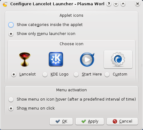
Just to show that there /is/ something happening with Lancelot, here
is the new configuration interface for the Lancelot applet (just for the
launching applet - not the application itself)
The applet is mostly finished (feature-wise).
It can be vertical (if in a vertical panel) or horizontal (default -
on desktop or horizontal panel). It now scales as it should so you will
not get it taking 50% of your panel…
The icon can be customized (unlike the current menus in 4.0 - both
use KDE logo as icon)…
Lancelot Launcher Config
There still are a few glitches - or to say crashes :) - while
applying the configuration on a working applet, but that will be fixed
soon.
