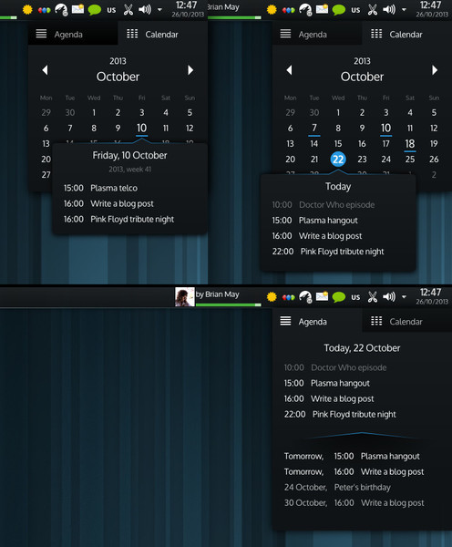
I’m working on different ideas for the activity switcher for plasma 2. Unfortunately, I haven’t had much inspiration for that. The only thing I had a real inspiration for was the calendar.
I really dislike out current calendar widget. It is confusing, and the layout is overcrowded and asymmetric (in a bad way :) ). It often confuses me when it shows events - I always think everything is today.
So I made this. It is just a mock-up, no real code yet. Opinions?
@Victor: <em>"Also, when showing today details, it would be nice to see the date too, as in other cases"</em>
Yes, of course :)
@avlas I don't really plan to change the clock widget part, at least not at this point. But, since 99% of everything will be QML, it shouldn't be hard to roll out your own version of any applet you like.
@labatts Yes, clicking will be required.
@Daniel We are doing everything in QML these days. I can't get away from that even if I wanted to.
@Kevin Kofler Well, holidays are like other events, maybe less important. Every type of event will get some sort of a highlight.
@Ilya Yes, korganizer needs to be the source for the data.
@Daniel Korbel I don't think we'll ever go for the dark-by-default setup, but it is changed easily.
@Abhinand Still fairly limited unfortunately. But, the mock-up would be possible even with plasma 1.
@apol I always liked darker themes more. But I hope that this will be as "flashy" with air :)
@Blackpaw @bull3t It is based on slim-glow, but it is not really a real theme - it is a mock-up.
@smis Not a bad idea.
@llpp Agreed. Pop-ups look cool, but are not really a solution. I planned to go for something along Aaron's idea.
@tom You are welcome to send patches, or to help creating shelf for qt5/plasma2.
@Aaron <em>clicking on a day could take you to the agenda view, however .. which would resolve all those issues nicely</em>
That is something I've been thinking for a while. Just was too lazy to mock that up as well :)
I'm afraid that will lead to too many clicks - the same reason behaviour for which I dislike kickoff.
@John To be honest, I don't like the layout of the proposal in the link. Namely the analogue clock. Maybe it looked nice to its creators, but it produces an unbalanced UI, similar to what we currently have.
As for the 'zooming' part which allows quicker month selection and similar, that is something I meant to do.
@konqoro <em>"...such a fuction so the tabs would better stay..."</em> The main reason for the tabs was that there are people who would rather have the event list opened by default, and not the grid. If it was hidden, to show up only after clicking, it would not fit those users.