I’ve been using Blogilo
for the last few blog posts, so I decided to write a few lines about
it.
The Good
Well, almost everything. The program really works and feels nice like
most KDE apps. Kate-based editor for the code - nice syntax colouring,
code completion etc.
The Bad
The generated html code is formatted badly. It wouldn’t be much of a
problem if you edit things using the ‘Visual Editor’, but it also
reformats your manually entered html code.
The code in the editor gets reformatted on Preview. And on ‘Submit’,
althoughit doesn’t change the code in editor, the submitted code to the
server isreformatted.
I was (more than) a bit silent lately. The thing called ‘life’
happens and you get dragged away from your computer ;)
Striped SAL
The strange thing is that lately, I’ve been doing more artwork than
coding, so the new openSUSE
11.4 is fully stripe-themed and (IMO) looks awesome.
I don’t use openSUSE, but that doesn’t mean I should avoid
contributing to one of the best KDE experiences out there, right? :)
(Ok, this ended up being a contribution even to Gnome installs which
required quite a lot more work, but I don’t really mind)
Striped SAL
The additional thing that made my day was the openSUSE review on the
Linux Action Show. Chris (one of the hosts) didn’t stick with the
original theming, but chose to use the standard blue Stripes with the
Slim Glow plasma theme. The only thing better than being the default is
being a choice over the default. :)
Coding again
Well, after reaching the artwork stardom :), I decided it was the
time to return to my true calling. The first thing in line were a few
Lancelot bugs that needed attention, and that don’t depend on the future
libplasma2 development. No new features yet - but stay tuned - there
should be some soon.
Activities
The main reason I got involved in developing the activities system in
the first place was to have different favourite applications, different
usage statistics (files opened, browser history etc.) in different
activities. It always seemed daft to have Inkscape, Gimp and similar in
the appmenu when I’m doing some non-GUI C++ coding.
The thing that will be responsible for that kind of stuff is the
kactivitymanagerd. It currently (4.6) only controls which activities
exists (along with icons, names, running/stopped states…), and which one
is currently selected.
The next big thing is making it track the user’s behaviour and things
that are accessed on per-activity bases. At first the data was supposed
to be stored in Nepomuk, but Sebastian raised concerns that it might
slow down the database too much (needs to be tested) since it would
require a vast amount of data to be stored.
The second option was to use Zeitgeist as proposed by Seif (the lead
Z devel). Now that we have a usable Qt API for it, the second option
became viable as well.
Since I’m not famous for betting all my money on one horse, I decided
to refactor the current code to be able to handle different backends,
and use the one(s) that is(are) available.
Features
Currently, the following is planned for the backends:
Nepomuk
Zeitgeist
Top rated[1] files[2] per (app, activity) pair
yes
yes
Top rated files per application
yes
yes
Top rated files per activity
yes
yes
Files accessed on a specific date
no[3]
yes
Rating will be automatically calculated based on usage
Files, locations, web pages, contacts etc.
If the tests show that Nepomuk doesn’t slow down when saving each
event individually, this will be a ‘yes’
No-backend support
Naturally, if you don’t want to use Nepomuk nor Zeitgeist, you’ll not
get the rating goodness. But that doesn’t mean you’ll be left out -
per-activity recent documents, places etc. are still a possibility.
Ok, this was a bit longer than I expected, sorry for that :)
A few discussions regarding the communication between FLOSS projects
are going on now. I’m not going to get involved in those for the time
being (mostly because Aaron already said enough) - I’m just going to
mention something that has no connection to Gnome, Canonical, or
anything like that.
I’ve recently found out that Lancelot was the default menu in Linux
Mint.
How did I found it out? Thanks to this bug report
which states that it was a showstopper for Linux Mint 10 to use Lancelot
as default. The good news is that the bug was fixed in a matter of
minutes after reporting.
The bad news was that nobody from the Mint even tried to notify me of
anything. How does anyone expect bugs to be fixed if those are not
reported?
From my point of view, this should have followed the following
algorithm:
Mint: Noticed a bug and they decided it was a showstopper for Mint
10 release
Mint: Report a bug (either by mail, IRC or BKO) stating that they
would need it fixed for the release
Ivan: Fix the issue, commit to SVN (now GIT) and send a patch
directly to Mint peeps
Ok, this sounded a bit fancier than it is. This post is not about
what the future phones might look
like, but rather about something related to touch-based UIs (or to
use the fancy term UX :)) that has bothered me for a while now.
Preamble: To be honest, I haven’t had much opportunity to use various
touch devices apart from my Symbian S60v5, and I’ve played a bit with
Androids. With that said, I have really no clue whether the ideas
presented here are implemented somewhere, but I haven’t seen them.
Current gestures
This part is a bit ranty, so feel free to jump down to the next
section. :)
When touch-based devices went world-wide, the most touted thing was
how natural the UI was. Palm WebOS closes the apps when (IIRC)
you drag them down, iOS uses pinch zooming, etc.
While I have nothing against these concepts, they work quite well,
let us consider how natural those actually are.
Get a pen and a notebook. When you finish writing, do you drag the
notebook down from your desk? No, you close it, and put it away.
Open your photo album, and take one photo out of it. Put it on the
table. Put your index finger in the centre and the thumb somewhere else
on the photo. Try to zoom it by stretching.
So, please stop using the word natural and replace it with
‘intuitive’ (which, again, can be debatable, but can’t be considered as
plain wrong).
Guided gestures
So, the gestures are useful to make some tasks quicker. The thing
that I want to be able to do faster is to chose a contact and call
it/send sms without the need to ‘click’ more than once. The gestures
could be ‘drag contact up to call’, ‘drag contact down to send sms’. But
that is not really intuitive.
Enter guides:
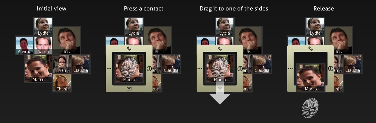
Mobile Concept 1 - Contact dashboard
The picture mostly says it all, but here’s a short synopsis - you
have your favourite contacts placed on the dashboard of some sorts.
Every contact gets a size proportional to how much you did contact
him/her. Other contacts are automatically added if you have unanswered
calls from them, or sms messages.
When you touch the screen, the guides appear - in this case you have
4 actions - call (up), sms (down), info (right), more (left). If you
want to send an sms, just move your finger down and release it.
Mobile Concept 2 - Message List
Now, the same for the message list. Dragging up/down behaves as
expected - list gets scrolled. But when you drag to left/right, you get
two commonly used actions - ‘delete’ and ‘forward’ (replying is embedded
in the bottom of the window - not shown in the picture).
When you touch one of the messages, you get the icon guides. When
dragging the item to one of the sides, the icon for that action becomes
less transparent, and so does the tooltip - as a visual indication of
how much you need to drag the item to perform the desired action.
QML
Just to note that these are not mockups - all UI is implemented using
QML - it is not yet connected to real data, but the widgets are as real
as they get. :)
I’ve made Fedora branded stripes to submit it for potential inclusion
in F15. Unfortunately, Mairin (the famous Fedorartist) explained that
wallpapers need to be published under a free license, and since mine
contained Fedora logo, it can’t be (that is, Fedora logo is TMed).
So, because I didn’t want to really throw away what I made, I made it
into a generic wallpaper dedicated to the infinity symbol. The nice
thing is that due to the distortion, it still resembles an ‘f’, so for
all you who requested a Fedora-branded Stripes, you can use this.
It is similar to the original Stripes with a bit stronger shade of
blue.
Stripes: Infinity
Implications
This means that no further distro-branding will occur unless one of
the following conditions are met:
I get an official request
The logo is published under GPL or similar license
For the second, if you use a distro that has it (for example, they
ship with a replacement for a KDE icon that has a distro logo on the
blue rectangle KDE logo used to be on), please give me a nudge.
Gnome 3 stripes
Well, I guess most of you saw screenshots of G3 and saw their version
of stripes (the default wallpaper). It is fun that both KDE Stripes, and
Gnome stripes were created (approximately) at the same time and (for me)
truly represent the differences between KDE and Gnome artwork (like
Oxygen icons vs Gnome’s).
Owl
I’ve got quite a few distro related requests. Some of them were made,
some not yet. If you sent me a request, and you didn’t get the
wallpaper, please send it again since I lost my mail archive.
I remember there was one distro with an owl as a logo, but I don’t
remember the name :( … for others, I don’t even remember the logos.