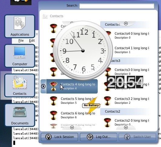
First of all, don’t sweat about the uglyfication of Lancelot’s theme in this screenshot. This was made just for testing purposes.
I am aware that this is the ugliest screenshot I’ve ever made, but I don’t care - it fits it’s purpose.
It demonstrates:
- Compositing - Yes, Lancelot now has true transparency thanks to Siraj’s QtDisplay class made for Raptor (I love free/libre software).
- Plasma’s applets - And, the second thing, Lancelot can load Plasma applets. Don’t know what’s the purpose of that, but it’s so awsome! :)

If you have read the commit digest feature of Lancelot, you know that these features were meant for 4.1, and not to be made right now. But, I get easily distracted from the main job by these small things.
The thing that will probably miss 4.0 although I was counting on it is the “Contacts” section. Most of the features related to it depend on the progress of Akonadi.


